

Table of contents
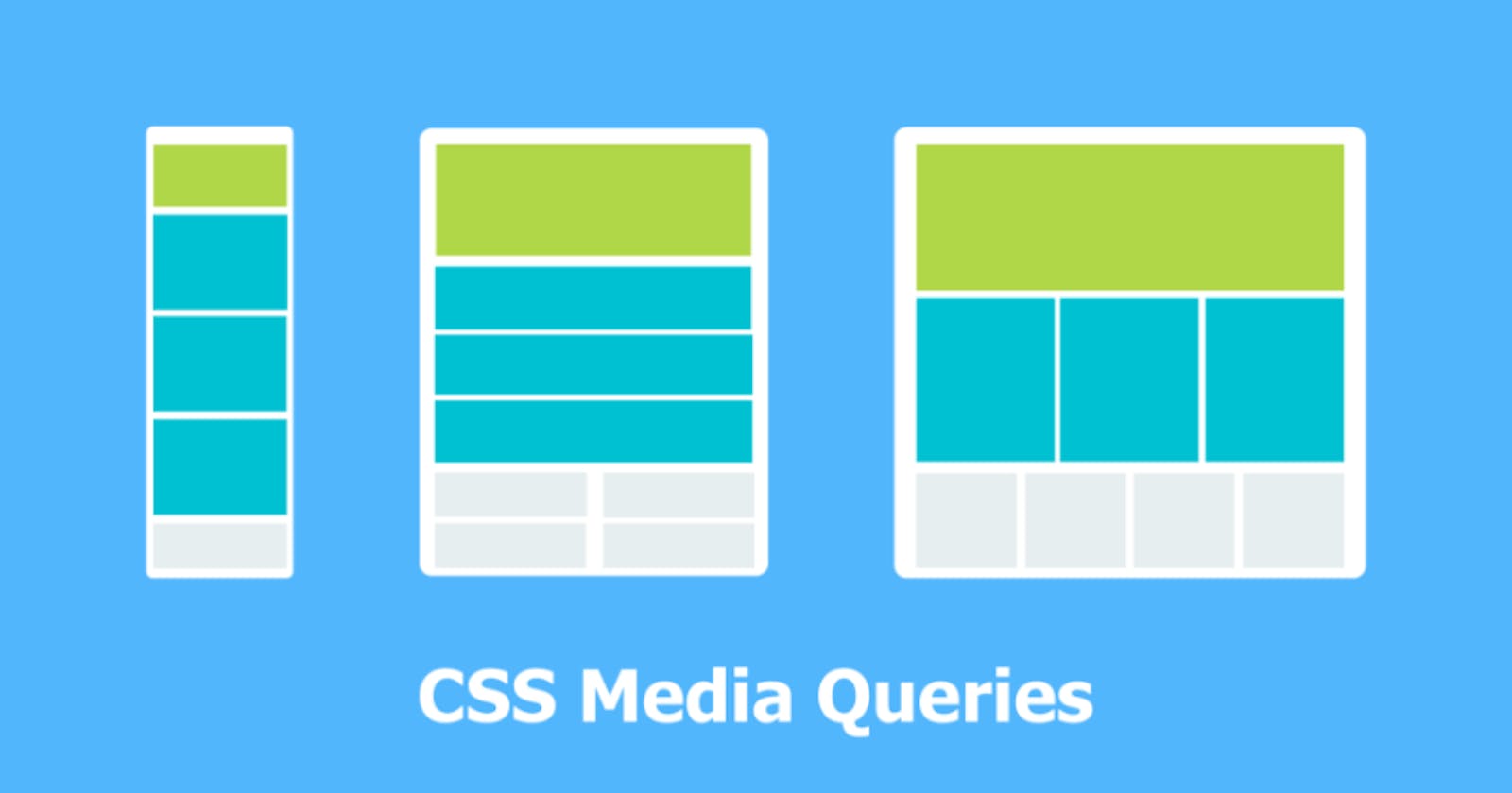
The Media query in CSS is used to create a responsive web design. It means that the view of a web page differs from system to system based on screen or media types. The breakpoint specifies for what device-width size, the content is just starting to break or deform. Using media queries is a popular technique for delivering a tailored style sheet to desktops, laptops, tablets, and mobile phones.
Media queries can be used to check many things, such as : the width and height of the viewport, the width and height of the device, orientation, and resolution.
Syntax:
@media not|only mediatype and (expressions) {
  CSS-Code;
}
Example:
This example illustrates the CSS media query with the different device-width for making it responsive.
Media Types in CSS:
all: It is used for all media devices
print: It is used for printers.
screen: It is used for computer screens, smartphones, etc.
speech: It is used for screen readers that read the screen aloud.
Features of Media query:
color: The number of bits per color component for the output device.
grid: Checks whether the device is grid or bitmap.
height: The viewport height.
aspect ratio: The ratio between the width and height of the viewport.
color-index: The number of colors the device can display.
max-resolution: The maximum resolution of the device using dpi and dpcm.
monochrome: The number of bits per color on a monochrome device.
scan: The scanning of output devices.
update: How quickly can the output device modify.
width: The viewport width.