

CSS Grid is a two-dimensional layout system that completely changes designing web pages and makes them far easier compared to the previous systems like floats. Elements are arranged in columns and rows much like a table and it also has a lot of customization options for every design. It also minimizes if not eliminates the use of floats which can be tedious to work with.
A CSS grid contains a parent usually referred to as a grid container and one or more child elements called grid items.
Syntax:
.parent{
    display:grid;
}
.parent element becomes a grid container and every element which is a direct child of the grid container becomes an item in that grid or a grid item.
Edit this text
Example:
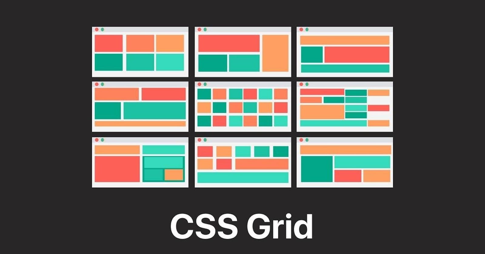
CSS Grid Concepts
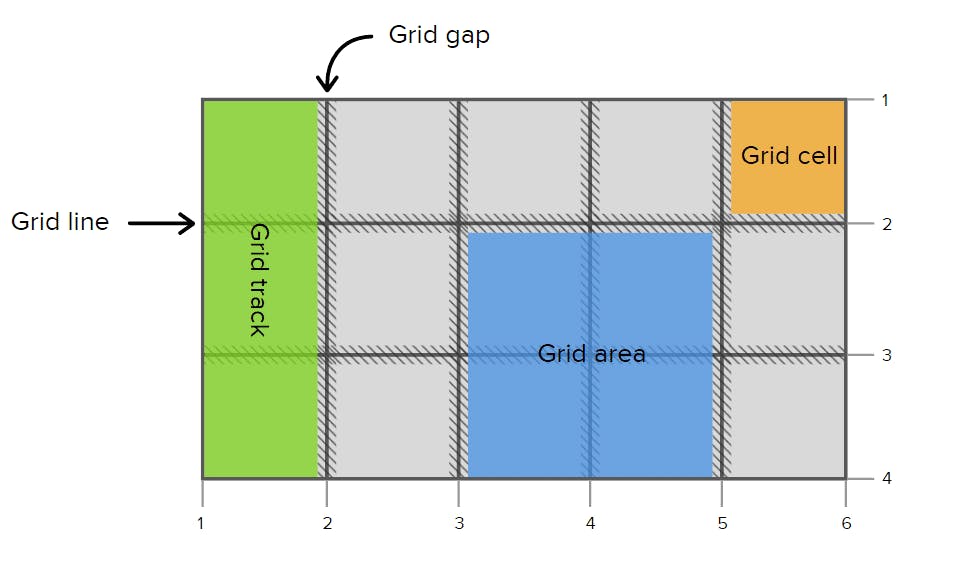
Grid Lines:
Grid lines are horizontal and vertical lines that run through the entire CSS grid. These lines separate elements from one another.
Grid Container :
The element on which display: grid is applied. It’s the direct parent of all the grid items. In this example container is the grid container.
.container{

  display:grid;

}
Grid Item:
All of the elements that are direct child of the grid container are known as grid items.
<div class="container">
  <div class="item"> </div>
  <div class="item">
    <p class="sub-item"> </p>
  </div>
  <div class="item"> </div>
</div>
Grid Cell:
Grid Cells are the space present between any four intersecting grid lines. From the table analogy, every table cell can be thought of as a grid cell too.
Grid Track:
The space between any two consecutive grid lines is called a grid track. The lines could be both vertical or horizontal. It is the space or the area between the lines.
Grid Area:
Grid areas are collections of grid cells that form a rectangular area on the grid. Grid areas can be of one cell or multiple cells.
CSS Grid properties
Properties for the Parent (Grid Container)
1. The grid-template-columns property:
We use this property to define the number and width of columns. We can either individually set the width of each column, or set a uniform width for all columns using the repeat() function.
2. The grid-template-rows property:
We use this property to define the number and height of rows. We can either individually set the height of each row, or set a uniform height for all rows using the repeat() function.
3. The grid-template-areas property:
We use this property to specify the amount of space a grid cell should carry in terms of columns and rows across the parent container.
4. The column-gap property:
We use this property to place a gap between Columns inside the grid.
5. The row-gap property:
We use this property to place a gap between Rows inside the grid.
6. The justify-items property:
We use this property to position grid-items inside grid containers along the X-Axis (Main Axis).
7. The align-items property:
We use this property to position grid-items inside the grid container along the Y-Axis (Cross Axis).
8. The justify-content property:
We use this property to position your grid inside the grid container along the X-Axis (Main Axis).
9. The align-content property:
We use this property to position our grid inside the grid container along the Y-Axis (Cross Axis).
CSS Grid Child Properties
1. The CSS Grid Scale:
We made this grid scale to demonstrate the calculations of how rows and columns are joined together. We can use any one of the two types of measurement:
The digit
The span keyword
2. The grid-column: start/end properties:
We use these two properties to join multiple COLUMNS together. It is a shorthand of two properties:
grid-column-start
grid-column-end
3. The grid-row: start/end properties:
We use these two properties to join multiple ROWS together. It is shorthand of two properties:
grid-row-start
grid-row-end
4. The grid-area property:
We need to set up grid-template-areas Once we've done that, we have to specify the names used in the parent class inside the children classes.
5. The justify-self property:
We use this property to position one individual grid-item inside a grid container along the X-Axis (Main Axis).
6. The align-self property:
We use this property to position 1 individual grid-item inside a grid container along the Y-Axis (Cross Axis).