

The Flexible Box Module aims to provide a better way to layout, align, and distribute space among items in a container. It was designed as a one-dimensional layout model, that's why flexbox deals with the layout in one dimension at a time — either as a row or as a column. Flexbox layout gives the Flex container the ability to adjust its Flex Items width and height to accommodate available space for all kinds of display devices and screen sizes.
Syntax:
.container{
           display: flex;
}
Before starting, you need to understand the relationship between parent and child classes. Check it in below -
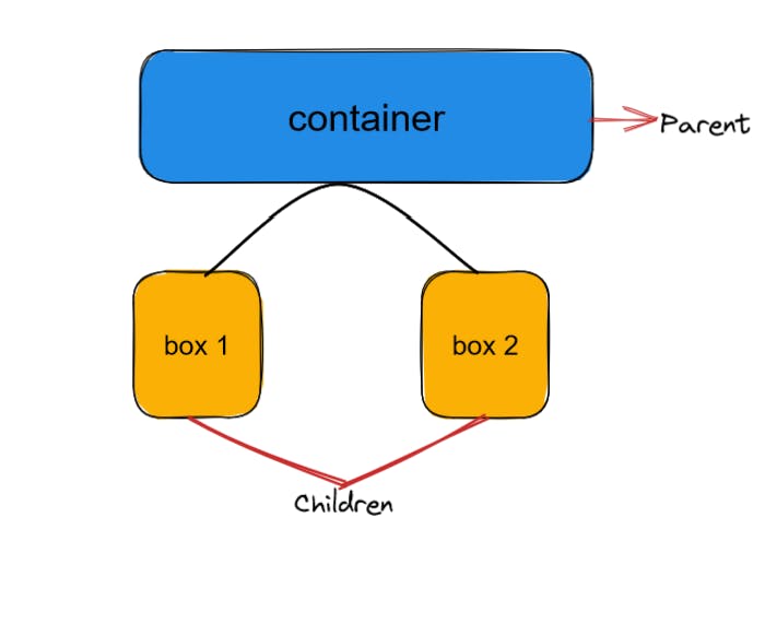
Properties for the parent(flex container)
The two axis of the flexbox :
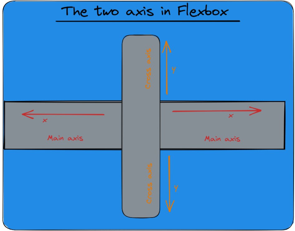
1. The main axis
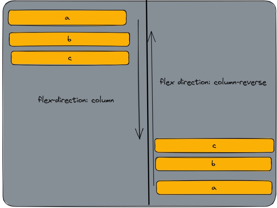
The main axis is defined by the direction of the flex-items being laid out. The start and the end of this axis are called main-start and main-end.
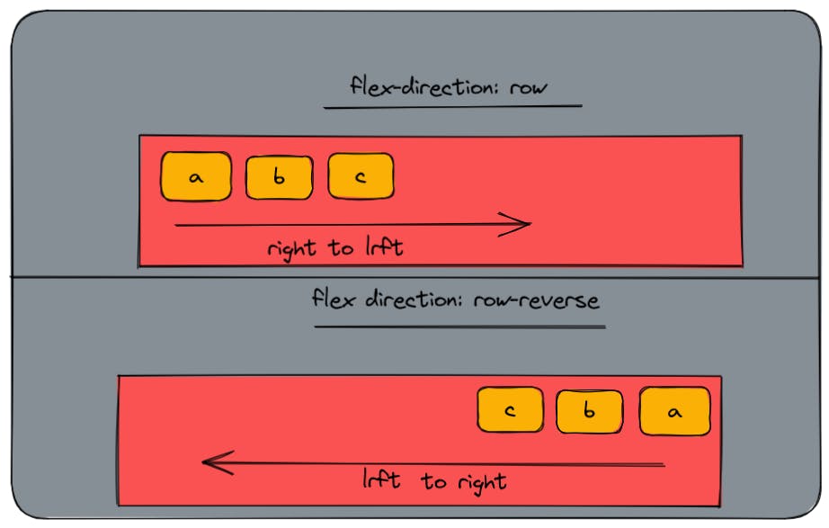
The main axis is defined by flex-direction , which has four possible values -
row : left to right (in the inline direction).
row-reverse : right to left (in the inline direction).
column : top to bottom (in the block direction).
column-reverse : bottom to top (in the block direction).
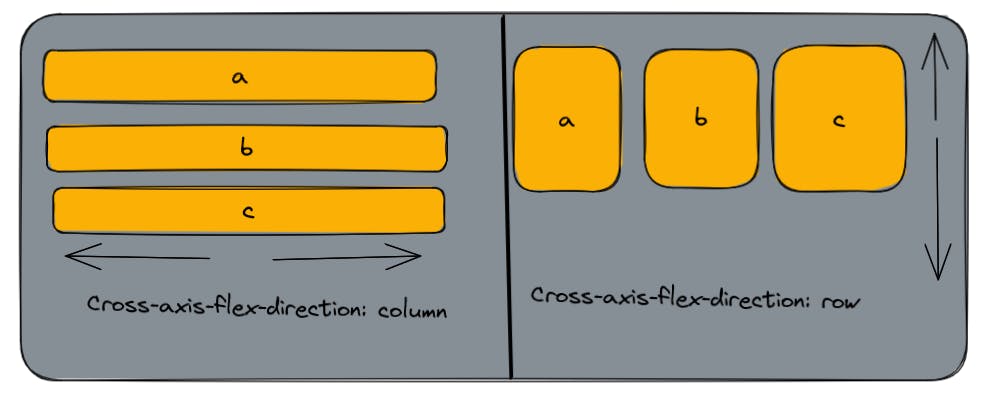
2. Cross axis :
The cross-axis runs perpendicular to the main axis.
row or row-reverse : if flex-direction (main axis) is set to row or row-reverse the cross-axis runs down the column.
column or column-axis : if flex-direction (main axis) is set to column or column-reverse the cross-axis runs along the row.
flex-wrap:
By default, flex items will all try to fit onto one line. You can change that and allow the items to wrap as needed with this property.
types:
no-wrap : all flex items will be in one line.
wrap : flex items will be wrapped into multiple lines, from top to bottom.
reverse-wrap : flex items will be wrapped into multiple lines, from bottom to top.
syntax:
.container {
  flex-wrap: nowrap | wrap | wrap-reverse;
}
flex-flow :
This is a shorthand for the flex-direction and flex-wrap properties, which together define the flex container’s main and cross axis.
syntax:
.container {
  flex-flow: column wrap;
}
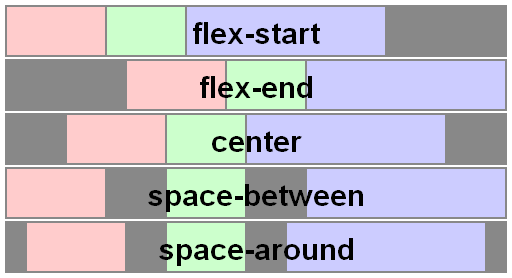
justify-content:
this defines the alignment along main axis, the direction in which flex-direction has set the flow.
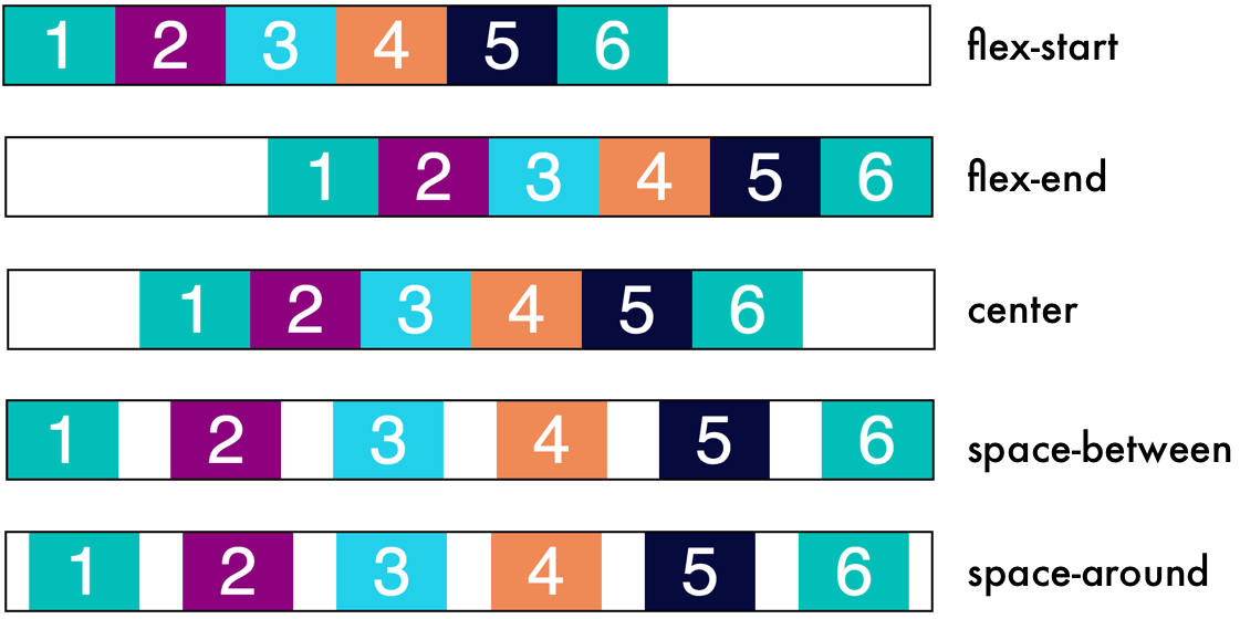
flex-start : default value of items. items are lain out from the start of the flex.
flex-end : items are lain out from the end of the flex.
start: items are packed toward the start of the writing-mode direction.
end : items are packed toward the end of the writing-mode direction.
left : items are packed toward the left edge of the container unless that doesn’t make sense with the flex-direction, then it behaves like a start.
right : items are packed toward the right edge of the container, unless that doesn’t make sense with the flex-direction, then it behaves like an end.
center: items are centered along the line.
space-between : items have an equal space between each other, but not between it and the container. In other words, the first and last item have no space between them and the container.
space-around: items have an equal amount of space between them, but the difference in this case is that the first and last item have some space between them are the container.
space-evenly: items are distributed evenly in the container, with an equal amount of space between all.
syntax:
.container {
  justify-content: flex-start | flex-end | center | space-between | space-around | space-evenly | start | end | left | right ... + safe | unsafe;
}
align-items :
Align items arrange and distribute items in a flex container along the cross-axis. Just like justify-content. It also has various values, those are in below -
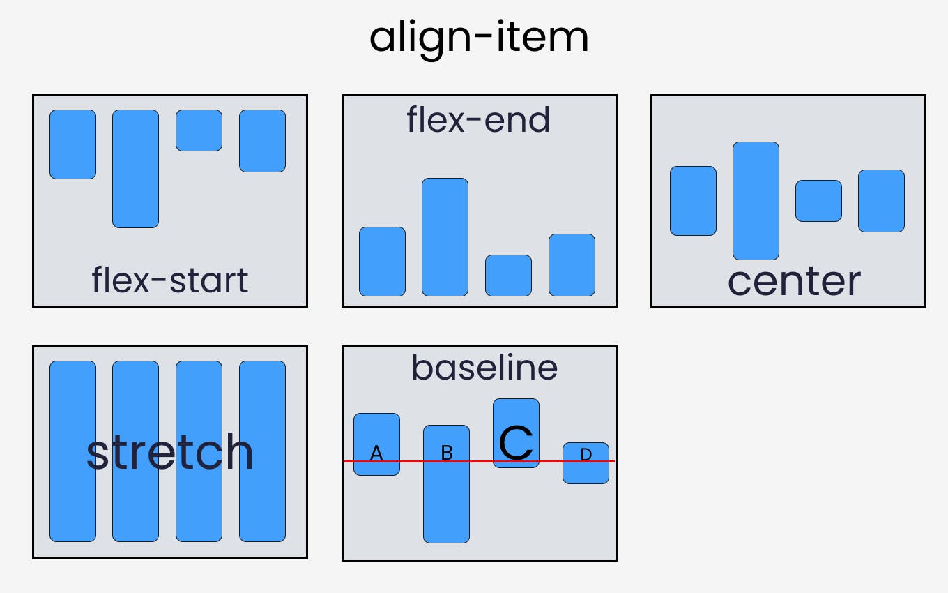
stretch: it's the default value. Items take up the entire space in the cross-axis.
flex-start: items are lain out from the start of the flex on the cross-axis.
flex-end: items are lain out at the end of the flex container.
center: items are lain out in the center of the container along the cross-axis.
baseline: items are aligned in such a way that the baselines are equal.
syntax:
.container {
  align-items: stretch | flex-start | flex-end | center | baseline | first baseline | last baseline | start | end | self-start | self-end + ... safe | unsafe;
}
align-content :
It helps to align a flex container’s lines within it when there is extra space in the cross-axis, similar to how justify-content aligns individual items within the main-axis.
flex-start: lines packed to the start of the container.
flex-end: lines packed to the end of the container.
center: lines packed to the center of the container.
space-between: lines evenly distributed; the first line is at the start of the container while the last one is at the end.
space-around: lines evenly distributed with equal space between them.
stretch : default value of align-content lines stretch to take up the remaining space.
Syntax:
.container {
  align-content: flex-start | flex-end | center | space-between | space-around | space-evenly | stretch | start | end | baseline | first baseline | last baseline + ... safe | unsafe;
}
The gap property:
The gap property explicitly controls the space between flex items. It applies that spacing only between items not on the outer edges. those properties are - gap , row-gap , column-gap
Syntax:
.container {
  display: flex;
  ...
  gap: 10px;
  gap: 10px 20px; /* row-gap column gap */
  row-gap: 10px;
  column-gap: 20px;
}
Properties for the Children(flex items)
order
Flex items are displayed in the same order as they appear in the source document by default. However, the order property controls the order in which they appear in the flex container.
Example:
flex-grow
This property grows the size of a flex-item based on the width of the flex-container.
flex-shrink
This property helps a flex item shrink based on the width of the flex-container. It's the opposite of flex-grow.
flex-basis
This defines the default size of an element before the remaining space is distributed.
Links you might find useful :